
Accessible Forms
Form accessibility can seem complex at first, but it closely related to several other accessibility features discussed in this guide. It is important to ensure your forms are accessible because they often collect important data from your user. Form accessibility includes PDF forms, contact forms on websites, intake forms, legal documents, etc.
- Plan Your Form's Design in Advance: Before creating a form, especially for legal services organizations, it is helpful to decide what the form's purpose is and how you might best communicate its use. For official forms, it is important to have a logo, organization name, form number, and form name (if relevant).
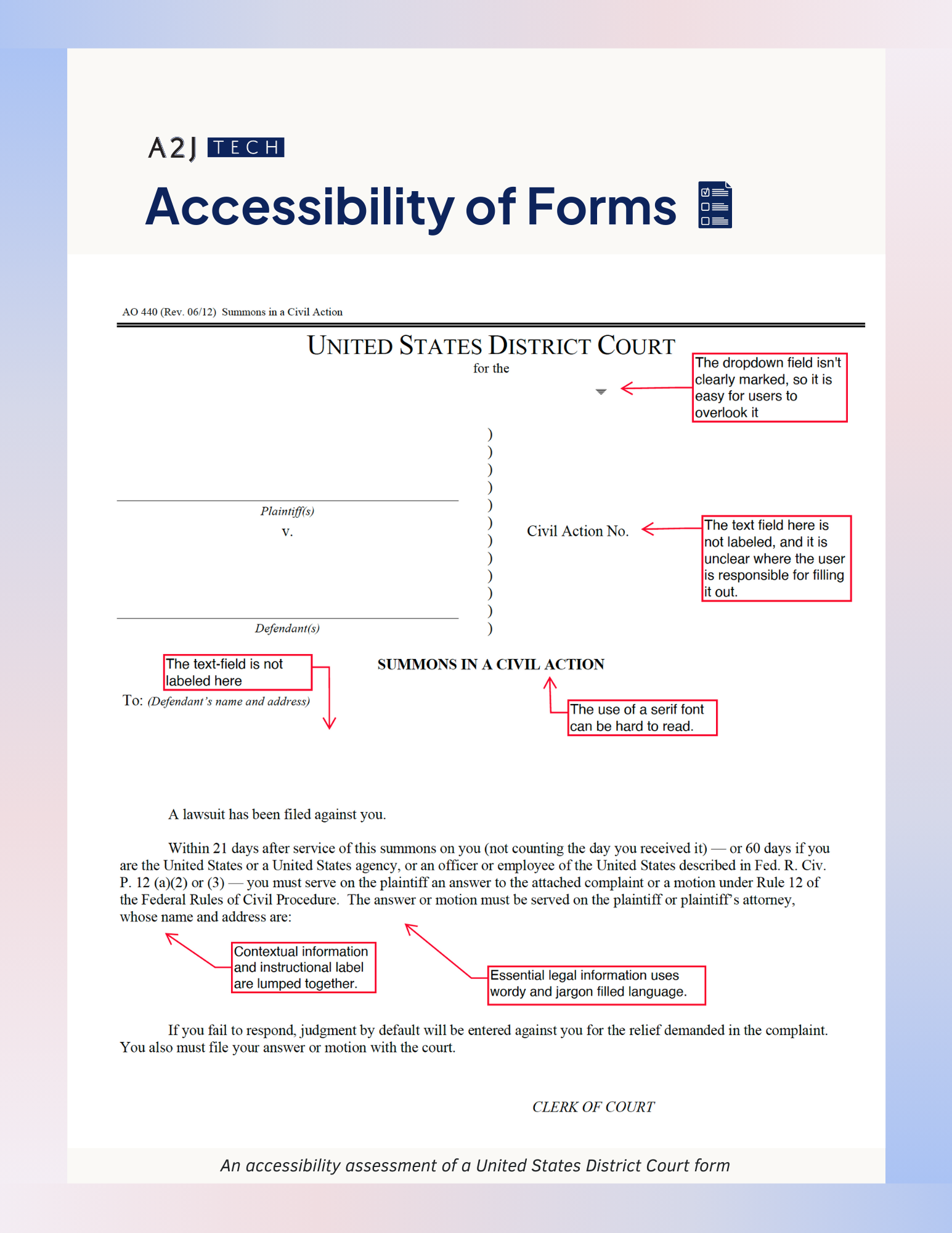
- Clearly Define Form Areas: For many official forms, there is often a section marked "only for official use". If your form needs this section, ensure that it is clearly distinct from the sections that the user must fill out. You can do this by adding helpful text, creating visual differences, and using darker colors.
- Label Form Elements: Always provide clear and descriptive labels for form fields. On websites, you can do this using the <label> element. Labels should be associated with their respective input fields through the for attribute or by nesting the input element within the label. For checkboxes and radio buttons, use <label> elements that wrap both the input and label text to increase the size of the clickable area.
- Provide Placeholder or Hint Text: Use placeholder text as a secondary means of providing context for the input field. However, do not rely on placeholder text alone to convey essential information, as it may disappear when users start typing. In these cases, it may be a better idea to provide Hint text that remains unchanged whether or not the user is typing and can provide directions for the user at all points.
- Check Placeholder Text and Form Labels for Color Contrast: Often, form text will have a low color contrast ratio. Ensure that your form consistently meets the WCAG stated color contrast ratio requirements.
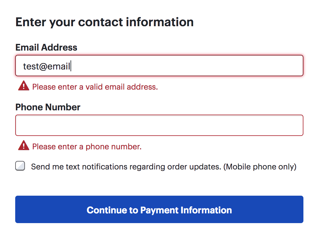
- Provide Error Feedback: Clearly communicate errors when a user makes a mistake. For website forms, use text, ARIA alerts, or error summary elements to describe the issue and provide instructions for correction. Ensure that error messages are announced to screen reader users, and consider adding ARIA attributes like aria-invalid="true" to identify erroneous fields.
- Provide Validation Feedback: If you choose to include error feedback, it may also be a good idea to let your users know when they do get their input right. Adding a green check icon is a common way to do this.
- Indicate Required Fields: If a field is required for submission, ensure that it is clearly displayed on the form. You can use labels or other universal symbols like "*" to indicate this.
- Offer Help Text: Provide clear instructions and help text when your form has specific formatting requirements. For example, "Please enter the date as MM/DD/YYYY". Use ARIA attributes like aria-describedby to associate help text with its respective input field.
- Group Related Elements: Group related form elements using <fieldset> and <legend> elements. This creates a logical structure for screen reader users.
- Follow Established Best Practice for Layout: Generally, it is better to ensure that you form is designed vertically, with form fields and their labels displayed from top to bottom. This makes it easier for the user to read as well as progress through the form comfortably.
- Test for Keyboard Navigability: Ensure that all form elements can be navigated and interacted with using the keyboard alone. Test the tab order to confirm that it follows a logical sequence.
- Include a Progress Indicator: If your form contains multiple steps, ensure that your users are aware of their position throughout the process by providing a progress bar or indicator.

- Provide Concise Instructions: Do not overwhelm your user with large chunks of text. If your user needs to memorize the instructions for the form, and it is otherwise not easily accessible as a reference, that is a good indicator that you should break your form up into digestible chunks. This is especially important for official court forms.
.png)
- Provide User Feedback Upon Submission: On websites, indicate to users whether their form was successfully submitted or not. Include accessible "Submit" and "Reset" buttons, and ensure that focus returns to an appropriate location after submission.
- Provide Details About Next Steps: Once your user completes your form, it is helpful if you can add key information about where they may submit it, any deadlines and fees, and who to contact if they have questions. You can usually add this information on a supplemental page.
- Check for Accessibility Before Converting to PDF Formats: Add alt-text, check for color contrast ratios, and assign a logical order for your form before you convert it to a PDF. It is highly recommended that you manually check the form for all these requirements. You can test your form to make sure that any errors are caught early on.
- Test the Converted Form: Once you do convert the form to a PDF, ensure that Adobe does not majorly change the layout and structure of your form. You should also make sure that each form field is associated with its own text label rather than being grouped together.